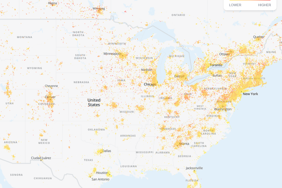

Ever wonder if radon is lurking in your neighborhood? There’s actually a cool tool for that.
Airthings built radonmap.com using real detector data from across the US. It’s like having a crystal ball for radon risk—except way more scientific and less mystical.
The map won’t tell you everything about your specific home. But it’s a neat starting point that reveals some surprising patterns about where radon shows up.
Let me show you how to use it and what those colorful zones actually mean.
What the Radon Map Shows
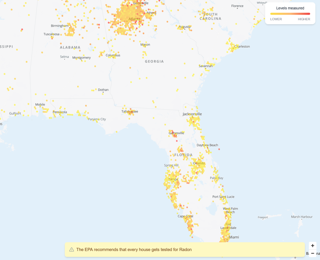
Here’s what makes this map interesting: it combines EPA geological data with anonymous readings from actual Airthings detectors, like the Corentium Home 2 I reviewed.
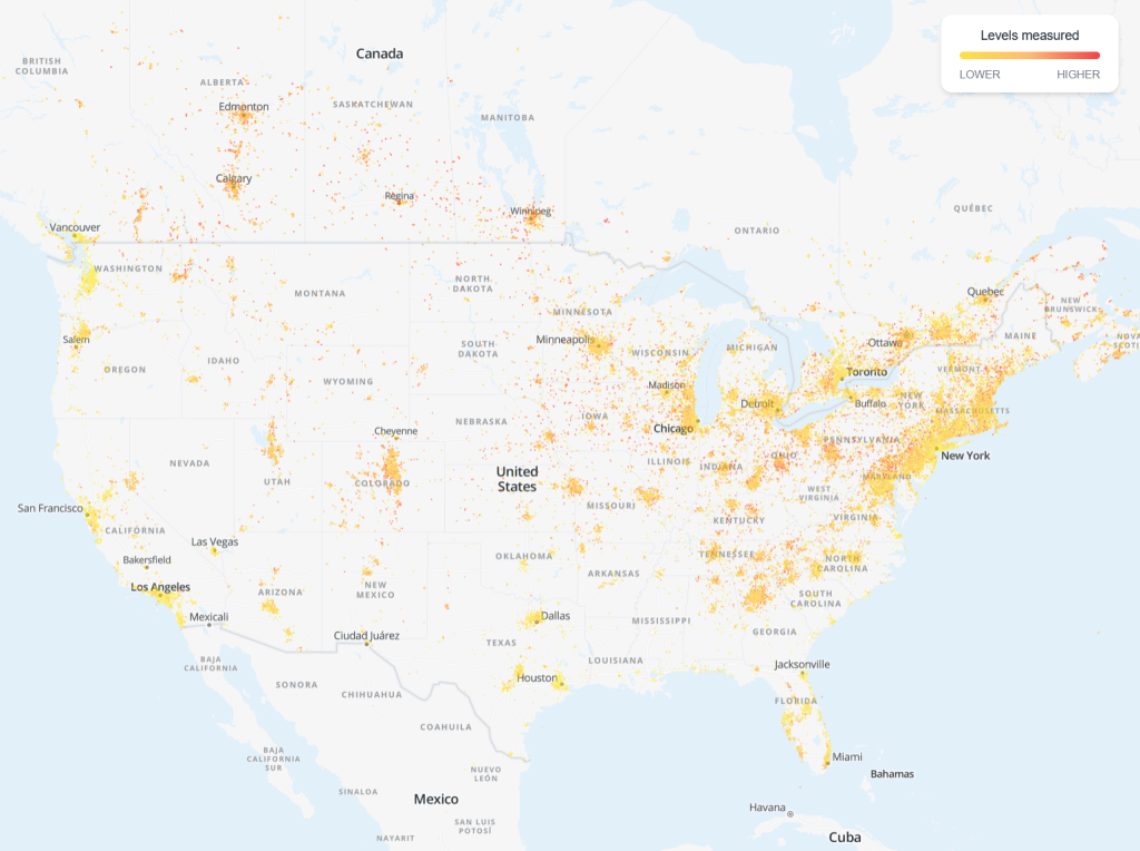
That second part is key. The map shows where people are actively testing for radon. Check out the Northeast—it’s packed with data points. That density suggests both high radon risk AND lots of folks monitoring it.
The color system is straightforward:
- Yellow: Lower potential risk
- Orange: Moderate potential risk
- Red: Higher potential risk
Pretty intuitive, right? But here’s the catch: this shows general area risk, not your specific home. Your house could be the outlier that breaks the pattern. Geology is weird like that.
How to Check Your Zip Code
Using the tool is refreshingly simple:
- Head to radonmap.com
- Type your zip code in the search bar
- See your color zone (green, yellow, or red)
- Explore nearby areas for context
- Click data points to see actual readings
The interface feels smooth and responsive. You can zoom around like you’re exploring Google Maps, but for invisible radioactive gas instead of coffee shops.
Pro tip: don’t just check your exact spot. Peek at surrounding zip codes too. Radon doesn’t respect boundaries.
Why You Might Still Need to Test Anyway
Plot twist: even green zones can hide radon surprises.
Your foundation matters. Basements typically trap more radon than homes on slabs. Construction age and ventilation make a difference too.
Geology gets granular. Underground rock formations change within neighborhoods. Your soil could be totally different from the house next door.
Seasons shake things up. Winter readings usually run higher because homes stay buttoned up. Summer levels often drop with better airflow.
Case in point: my Southeast area shows “lower” risk on the map. Yet my Corentium readings bounce around week to week. The map didn’t predict that variability.
Maps guide you toward testing—they don’t replace it.
My Take on the Map’s Accuracy
This tool offers a fascinating peek behind the curtain of radon monitoring.
That Northeast concentration isn’t just geological—it shows where people actively test for radon. Higher awareness creates more data points, which makes the map more reliable for those areas.
As a conversation starter, the map works great. It helps you understand your area’s general risk profile. But I wouldn’t bet my family’s health on color coding alone.
The regional patterns are genuinely interesting though. My screenshots show clear differences between areas, even if individual homes don’t always follow the trend.
Think of it like checking weather before a picnic. Helpful for planning, but you still might get rained on.
Check the Map, Then Test Your Home
The radon map is a handy tool for getting your bearings on local risk. It’s worth a quick look to see where your area stands.
But maps show possibilities, not realities. Your home’s actual radon level depends on testing your specific space.
Here’s your action plan:
- Peek at the map for general awareness
- Test your home regardless of the color zone
- Consider seasonal monitoring if readings vary
- Get professional testing for real estate deals
Even us folks in “lower” risk areas get reading surprises. The map guided me toward testing, but my detector told the real story.
Ready to dive deeper? Check out my radon overview guide and real-world testing results for complete detector recommendations.
The map is fun to explore—but your peace of mind comes from actual testing.